Many J.P. Morgan Wealth Management clients use our online and mobile tools to make self-directed trades when markets are open, playing active roles in managing their portfolios. In today’s fast-paced financial markets, agility and real-time access to trading opportunities are crucial for success. Implementing a native mobile trade app versus relying on a hybrid app is a strategic move to empower investors with seamless, on-the-go access to their portfolio and markets, but to get there we needed to know what was working in the current environment, what was not, and why.
To provide clients with better service, we set out on a journey to develop a more intuitive and responsive user interface on our self-directed trading platform’s native mobile application. The results included delivering an uplifted UI that reduced the time it takes to place trades by 20% and increased trade order completion rates by 10%.
These results indicate improved client engagement and contribute to increased client satisfaction, as users can now execute trades swiftly, monitor market movements instantly, and manage their investments efficiently with an app that is much easier on the eyes with improved speed and responsiveness.
Here's how we got there.
Defining Improvements to Client Experiences
Before we could ideate and build, we needed to define what issues our clients were encountering and the causes. We identified six key areas to focus on.
- Performance Issues – Hybrid apps are not as fast as native apps, leading to slower load times and lag, especially during heavy trading periods.
- User Interface and Experience – Inconsistent design and behavior between the web and native components can confuse users. The app did not feel as smooth or intuitive as a fully native app.
- Device Compatibility – Hybrid apps do not perform well on devices, leading to compatibility issues. Differences in screen sizes and resolutions can also affect the app’s appearance and usability.
- Security Concerns – Hybrid apps can be more vulnerable to security threats compared to native apps, which might have more robust security measures integrated.
- Battery Usage – Hybrid apps can be more resource-intensive, leading to higher and better consumption compared to native apps.
- Limited Access to Device Features – Hybrid apps have restricted access to certain device-specific features, reducing functionality compared to native apps.
The results of these efforts were not only measurable in terms of improving speed and trade completion rates, but also to develop a solution that provided positive experiences for users on both the new mobile app and online, such as:
- An intuitive, easy-to-navigate design that enhances the trading experience for both beginners and seasoned investors.
- Real-time market data and updates to give users the most current information available.
- Robust security measures to protect their investments and personal information.
- The capability for users to manage their portfolios and execute trades from anywhere at any time.
- A responsive customer support team.
Implementing the trade feature natively allowed us to use the full potential of the device’s hardware and operating system, resulting in faster load times, smoother navigation and more responsive user interactions. Native apps follow platform-specific design guidelines, making the UI and UX more consistent with the user’s expectations. This includes smoother animations, gestures and layouts that are more intuitive. They also look and behave similarly to other apps on the device, providing a familiar experience to users.
Native apps can implement system-wide gestures like swiping, pinching, or force-touching. These gestures are built into the operating system, giving native apps more fluid interactions compared to web-based or hybrid apps, and since native apps are built and tested specifically for the platform, they tend to be more stable with fewer crashes and bugs.
Ideating Our Journey
The first step was assembling a Self-Directed Investment (SDI) Mobile team consisting of product owners, designers, iOS and Android engineers, and service engineers to design and develop an intuitive native trade flow.
During ideation, the team landed on creating a solution that provides fast loading times and a feature flag pattern that enabled clients to turn app features on or off. The solution also required a native, guided experience with modern design language, simplified UI, quick load time, and fewer steps to make a trade. The most important information needed to be clear and prominent on each step, with concise language and contextual help.
This journey involved transitioning from a hybrid mobile app (built using web technologies like HTML, CSS, and JavaScript) to a native mobile app developed specifically for the iOS and Android platforms to:
- Improve performance
- Provide a better user experience
- Gain access to platform specific features
- Present a more polished and integrated look and feel
The team also determined that a controlled rollout was needed to reduce the risk of large-scale issues and enable them to track the trade feature performance during production.
Building the Solution
Our singular Chase Mobile® app had already been built so we brought our iOS and Android engineers quickly up to speed on its component architecture. Lead engineers for the native trade app reviewed how they built the components (dependencies and routing) architecture, which uses simple, standard and scalable methods for building standalone components.
The team implemented a functional component, or set of related items that belong to a given product area and designed to be included within the larger Chase Mobile app. At a high-level, a functional component is responsible for:
- Owning all business rules
- Coordinating and executing all service calls
- Maintaining all data models, rules, and caches (if applicable)
- Creating all UI elements/flows
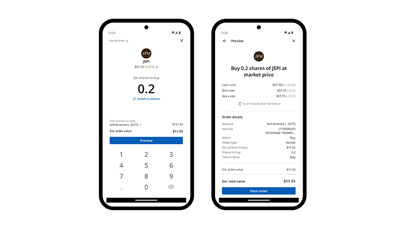
At the outset, we wanted to provide users with a consistent experience across devices. We used common components across the Chase Mobile app, ensuring a seamless and familiar experience for users on each platform. We also leveraged native development by designing and customizing the user interface to make it more polished. For example, our design team designed a custom keypad for fast and precise data entry, optimizing the user interface for trading-related tasks, reducing the risk of errors and improving the overall user experience. The custom keypad allowed us to have control over the layout, features and functionalities, which is very valuable for adapting to changing market conditions or incorporating unique trading strategies.
Native development enabled us to take full advantage of the underlying hardware and software of each platform. This resulted in faster app performance, smoother animations, and lower response times. This achieved one of our goals of providing an overall more responsive and enjoyable user experience.
A Parallel Development Process
While the teams were working on separate codebases for operating systems, they maintained synchronization through regular meetings and version control, and developers that worked on the same story would collaborate and confirm that the logic was implemented the same. Code review sessions allowed the developers and QA to understand the implementation on each platform.
When we started developing the native trade app for J.P. Morgan Wealth Management we used a feature-based development workflow. Each developer checked out the feature branch and made all the code changes there, never pushing code changes directly to the main branch. This allowed us to work on our features without worrying about breaking the production code.
However, featured-based development caused frustration and a decline in productivity. For example, when multiple pull requests are queued to be merged into the main branch, the release captain is responsible for reviewing the pull requests and merging them to the main code quickly. This can lead to conflicts and cause us to wait longer for merge approvals. This delayed the build and when our QA engineers could start testing.
To address frustration and increase productivity we moved to trunk-based development, where developers work on a single branch (“trunk”) for most of the development cycle. Changes are integrated directly into the main branch as quickly as possible, promoting continuous integration, faster feedback and reduced merge conflicts.
We worked closely with our service team to understand all the APIs and responses for backend integration. We applied the contract-driven development (CDD) approach, also known as contract testing, and emphasized creating and testing contracts between different parts of our systems such as microservices, components, and APIs. This approach ensured that different system components communicated effectively and met the expected requirements and expectations. The server and mobile teams defined contracts that specified the expected behavior of the APIs, including data formats, response times and error handling. CDD allowed us to quickly create mock or stub implementations of the APIs or services based on the contracts. In turn, our developers were able to work on different parts of the app in parallel and independently test their components against the mocked contracts.
Quality Assurance
Our quality assurance process involved rigorously testing the app on various devices and simulators/emulators. To reduce the time it takes for our feature(s) to become interactive and start testing quickly we use a ShellApp.
Our ShellApp is a lightweight entry point into our Chase Mobile app we use for testing. The ShellApp only initializes the essentials, such as navigation, basic UI components, or core services needed to run specific features like trading. The basic ShellApp UI has entry points into features, enabling us to quickly start testing changes made to specific features without having to load the complete app including frameworks, libraries, or business logic.
We resolved bugs, optimized performance, and improved usability. Desk checks provided the entire project team with an opportunity to verify that everyone was on the same page and our product was working accordingly. Beta versions were released to a select group of users for feedback. To bring autonomy and not depend on the larger Chase Mobile® App binary, we created a minimal Retail framework that provides the application’s core components to speed up testing our framework. We used a mock server to reduce dependency on the user acceptance test (UAT) environment. This iterative process helped identify and address issues before launch.
Ensuring our app is ADA compliant makes it accessible to individuals with disabilities and promotes inclusivity and equal access to our app’s content and features. Testing our mobile app for ADA compliance brought some challenges. We must account for a wide range of disabilities including visual, auditory, motor and cognitive impairments. Frequent updates to our app must ensure that these updates maintain ADA compliance, and we continuously educate the development team on accessibility best practices. To be agile, we also ask our development team members to perform ADA testing.
Lessons Learned
The collective efforts of everyone involved and the results of our evaluation, ideation and building processes yielded several learnings that can be applied to future projects, including:
- User Feedback Integration – Regularly gather and integrate user feedback to improve features and user experience.
- Use beta testing phases to refine the app based on real user interactions.
- Provide clear onboarding and tutorials to help users understand the app features.
- Offer robust customer support channels to address user issues promptly.
- Conduct thorough testing early in the development process.
- Use automated testing frameworks to streamline the process.
- Continuously monitor and optimize performance to ensure the app remains fast and responsive.
- Address performance bottlenecks as they arise and optimize server responses.
Release Process and Results
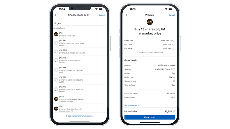
The final trading app design is simple, clean and user friendly. The mobile architecture is modular for future features like mutual funds, dollar base trading, and options.

Pictured: Mobile app screenshots of full shares being purchased.
We used the feature flag design pattern that allowed us to turn application features on or off to control the rollout of the app’s features to minimize the risk of widespread issues and allowed us to monitor feature performance in production. This approach also helped us collaborate between marketing, product, and development to fine tune features based on data and user feedback.

Pictured: Mobile app screenshots of fractional shares being purchased.
The result is a more intuitive and responsive app for investors to manage their trades with on-the-go access and real-time data, and another valuable innovation delivered by our teams with learnings that can be applied across Chase.
Like what you’re reading? Check out all our opportunities in tech here.
JPMorgan Chase is an Equal Opportunity Employer, including Disability/Veterans
For Informational/Educational Purposes Only: The opinions expressed in this article may differ from other employees and departments of JPMorgan Chase & Co. Opinions and strategies described may not be appropriate for everyone and are not intended as specific advice/recommendation for any individual. You should carefully consider your needs and objectives before making any decisions and consult the appropriate professional(s). Outlooks and past performance are not guarantees of future results.
Any mentions of third-party trademarks, brand names, products and services are for referential purposes only and any mention thereof is not meant to imply any sponsorship, endorsement, or affiliation.